Arc Browser - The future of browsers
Before I start this article I wanted to give a shoutout to Taksh Shah and Blanklob. Taksh for sharing an invite link to Arc and Blanklob for connecting us!
What is Arc?
As they say on their website, Arc is a browser, but is also everything you care about in one place.
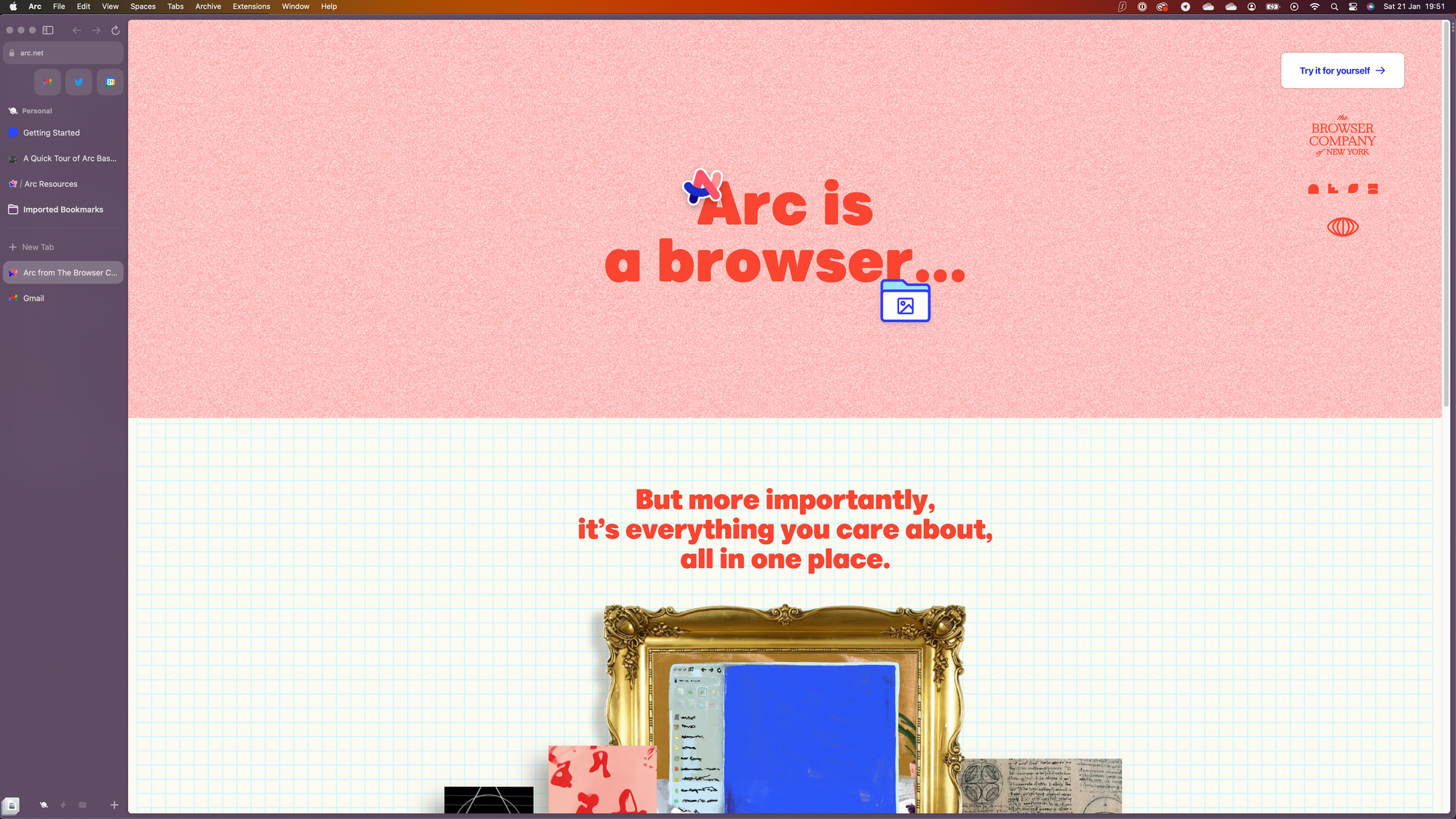
On their website there is not a lot of information. The two call to action buttons that are placed there are the "Try it for yourself" buttons which lead you to a form to request beta access. Thanks to Taksh, I did not have to wait for my invite and could download it straight away!
As soon as you open the program you are being welcomed by a beautiful annimation with the proper sound design to make the experience complete. After that, there is a setup. You need to create an account for Arc, set your colors, import your other browsers and after that you're done.
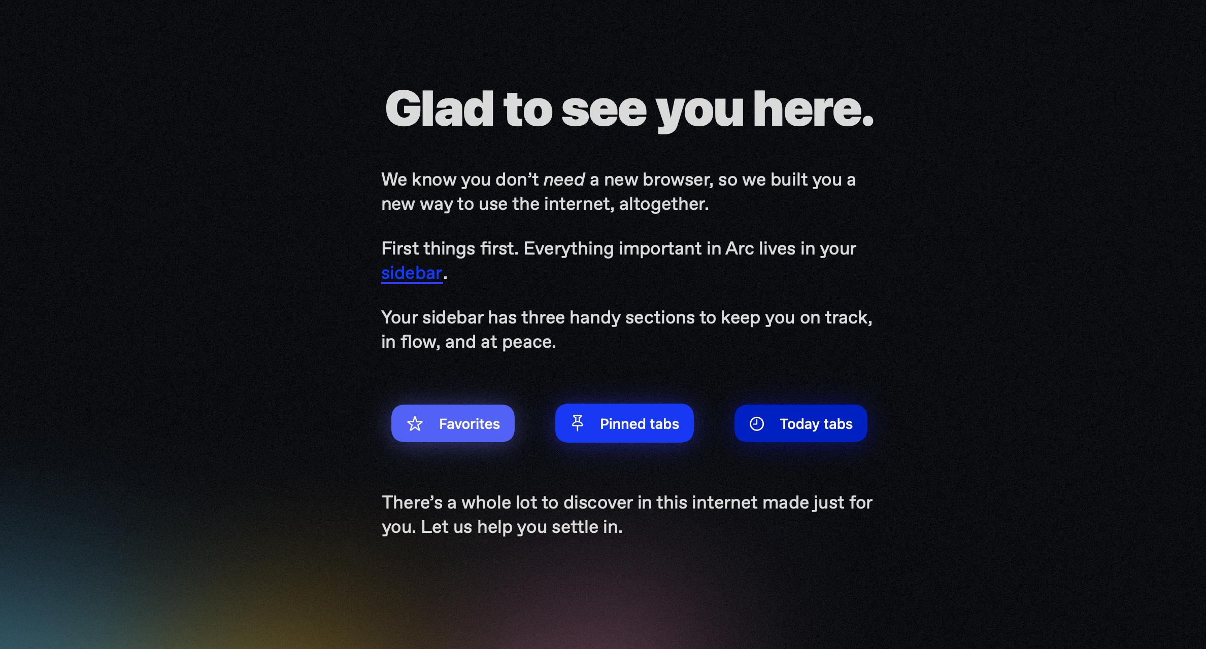
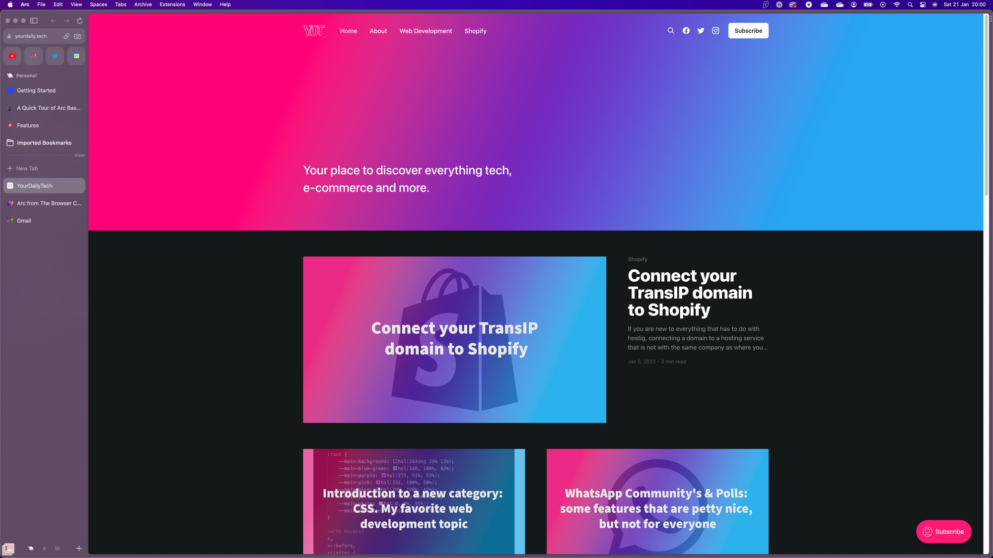
The most important thing about Arc is the sidebar as they say on their start screen. And after using Arc for a bit you can quickly see why they say that. In the top of your sidebar you have some app icons for your favorite apps.
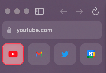
Below that, your normal tabs are displayed. There is a small difference between your normal browser and Arc in this part, and that is that the tabs are in the sidebar instead of at the top like in for example Google Chrome. The main browser lives in a "big card" as I like to say. And to be honest, I actually pretty like this design. For some reason it gives me a more "immersive" feeling when using a website. I think this design comes from all the chat apps where you have your chats at the left side and the actual big chat as a big card on the right.
Spaces, Folders, Easel's and Notes
Spaces
One of the main things that makes Arc pretty interesting are their "Spaces". Spaces are bassicly tab-groups. You can have a personal tab-group, a work tab-group and bassicly any type of tab group you want. The "important" tabs that need to stay will be above the slightly visable devider line, where the not so important tabs you often just close will be below this line. Every tab above the line will also be linked to that tab group by default.
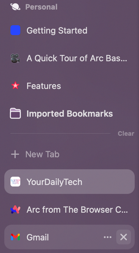
You can create however many tab-groups you want which is really great for people that, like me, work on a lot of different projects at the same time.

Folder
Folders in Arc are pretty simple, its actually just anotther name for our well known Bookmarks. As someone that uses a TON of bookmarks (yes I need to clean them up soon) the only thing Arc changes here for me is that it looks a little nicer.

Easel
You might be thinking... what the f*ck is a 'Easel', well you're not alone as that was also the first thing that came into my mind.
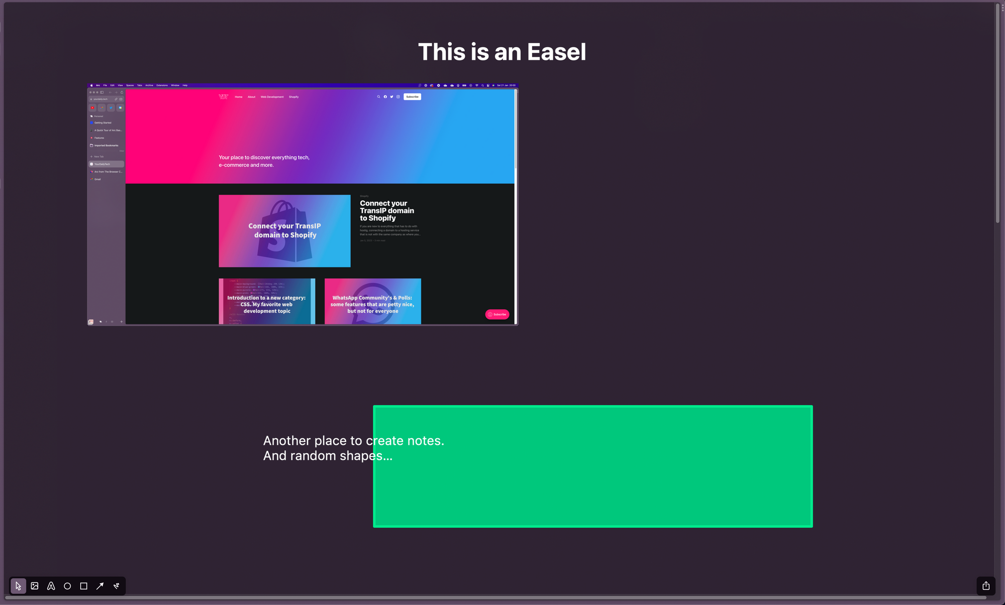
Well an Easel apperantly is Arc's way of creating notes/whiteboards which you can share to everyone, or just people with a link, but can only be edited in the Arc browser. I am going to be honest, I have absolutly ZERO clue why this would be a useful feature in a browser. Especially since there are a ton of apps available that are probably doing a way better job at this.
Notes
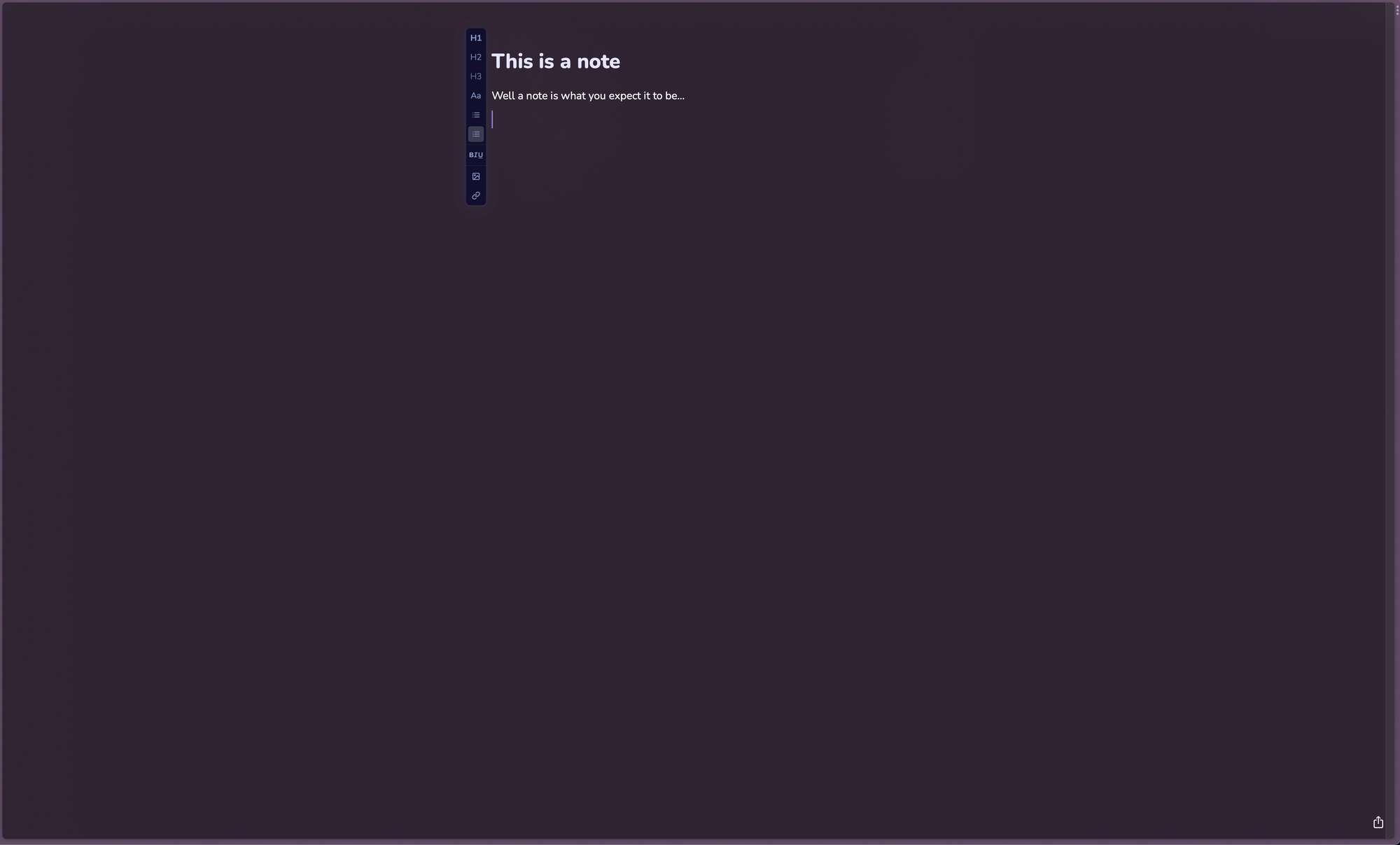
And the last one, Notes. A note is EXACTLY what you expect it to be... a simple way of creating notes whith headings, images, text and lists. To be honest, with apps like Notion this is another feature of Arc that I simply don't understand. However, some people might find it usefull if they are just starting with taking digital notes and just want to do everything from their browser.
For both Notes and Easels, the browser asks permission for your documents as it wants to be able to add images from your downloads etc. in the note or easel.
The browser
As a browser Arc is doing a nice job. Especially for people like me that are developers I think Arc will be quite nice. It runs on the Chromium engine as you can clearly see when opening the "Inspector".
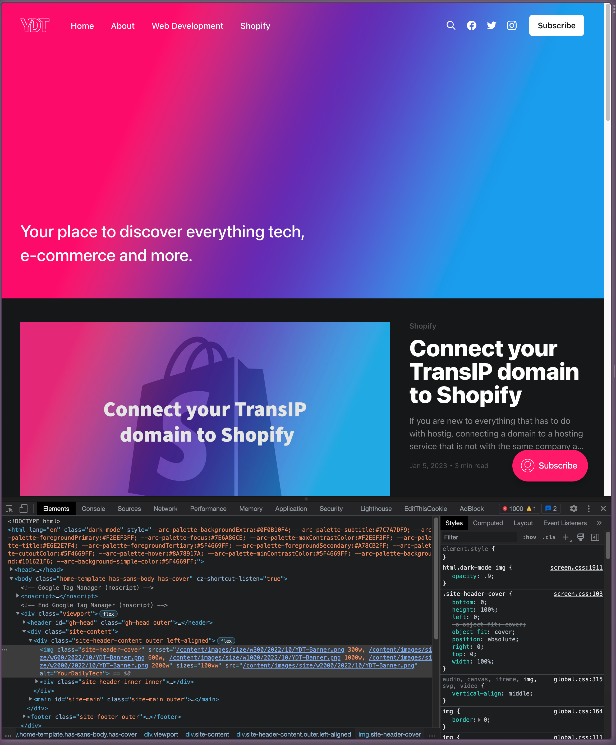
One thing that I do really like about the Arc browser is that it has a build in feature for "split screen".
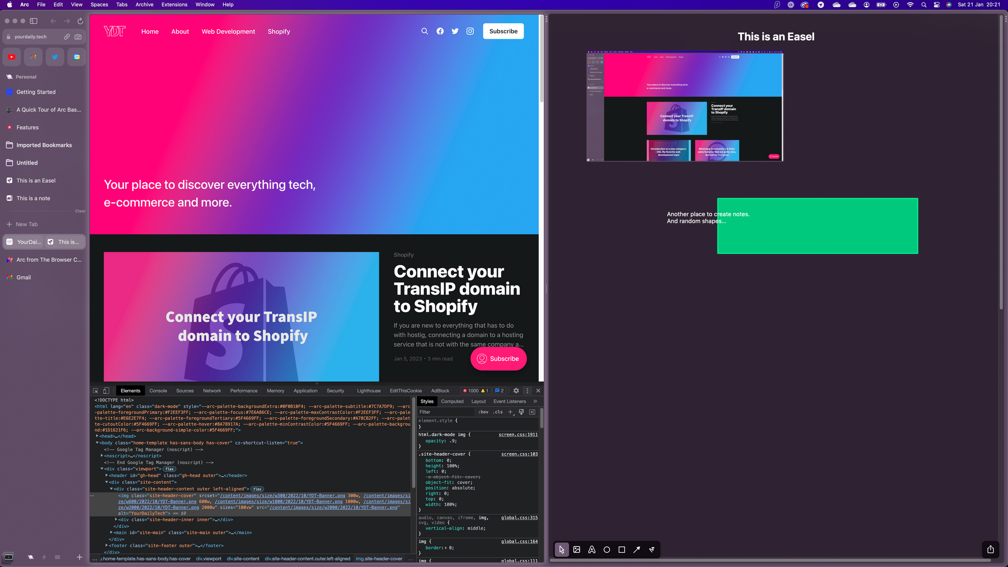
This is actually a place where the "Easel" or "Notes" feature will come in handy, however I think I would just much rather like to use Notion or Todoist in the second window. You might be wondering, only a split screen? Noop! You can actually add more windows and resize them as well.
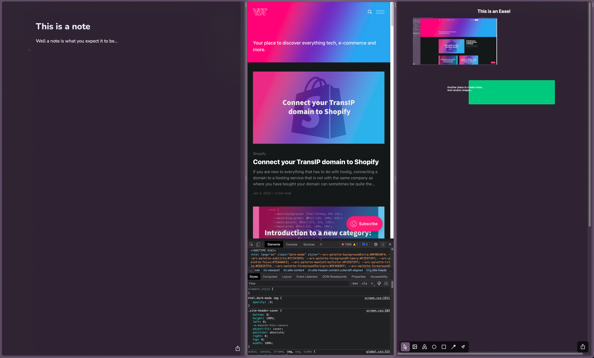
This feature will be absolutly brilliant for developing mobile versions of websites. Unfortunaly as of now this view only supports vertical windows and not horizontal windows, none the less, its a really cool feature that I acutally really like.
PIP Video's
Another cool thing is their build in Picture in Picture mode video option. Just start a video on for example YouTube and open a different program. The video will automatticly start playing in the PIP screen so you can keep watching the video while for example editing a document.
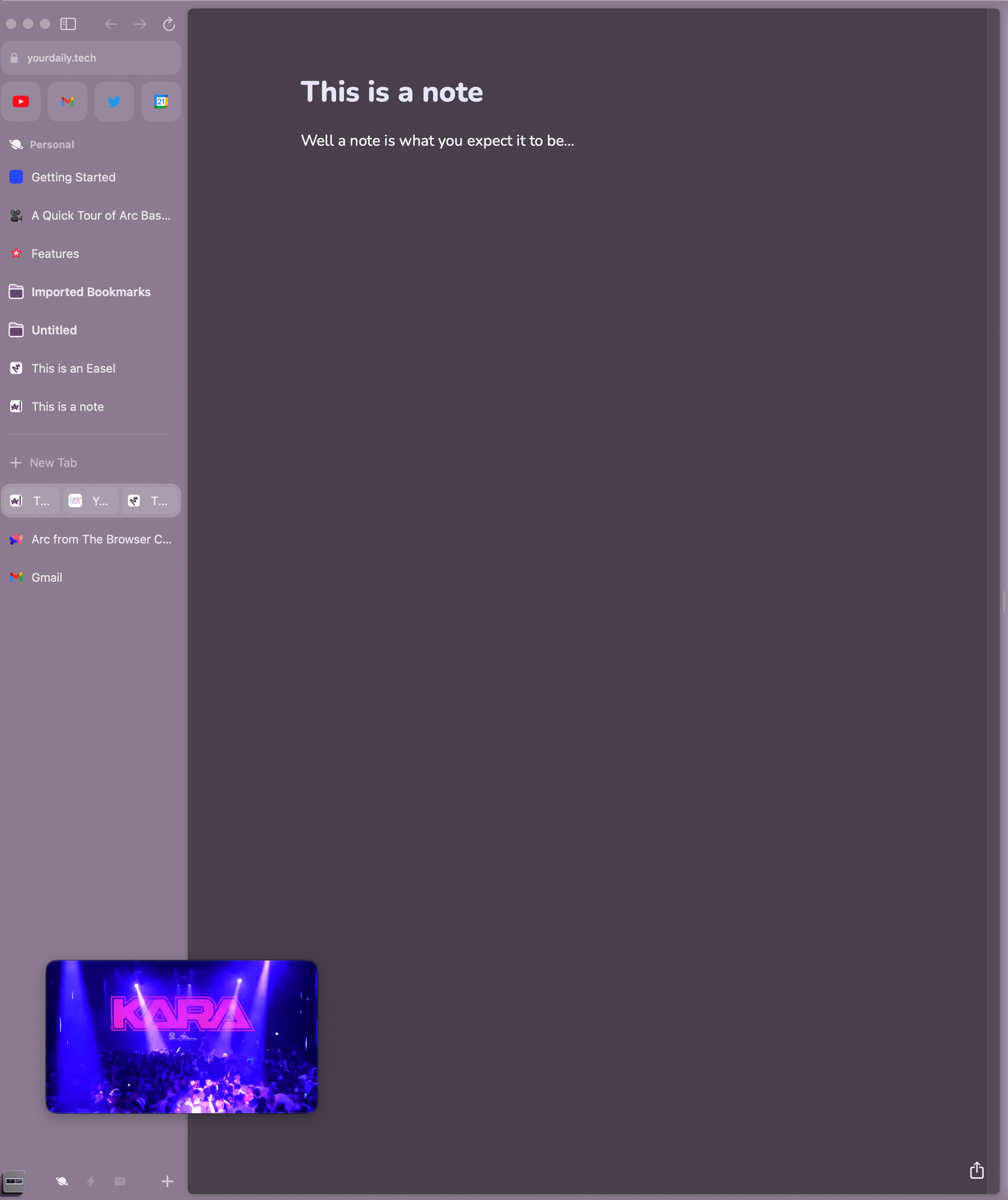
Little Arc
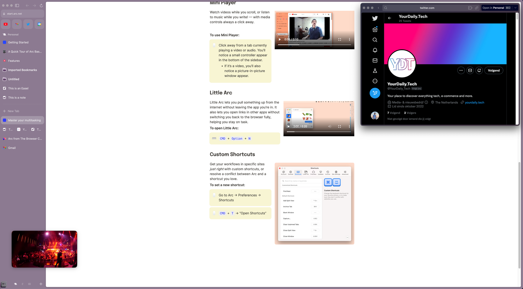
The "Little Arc" feature is something I kinda like but still have to see how it would actually work. You can open a "mini browser" while browsing in order to quickly search for somethin. It will open another window which will keep running but this is actually really smart. Especialy if you just need to search for something quickly and check with what you are seeing in your main browser window.
Conclusion
After using Arc for a couple of hours, I think Arc has the potential to become a really good browser. It needs some work, but also some time for me to get used to it, but it does not take away the fact that so far I like it pretty much!
The split screen view is really cool and will definitly help a lot with productivity. However, the Easel and Notes feature I don't think I will be using that much. Especially since you can also put your Notion or other notes apps in a split screen view.
If you want to keep up to date on my findings, follow me and YourDaily.Tech on Twitter.
Note: Arc is currently in Beta and only available on Mac.
